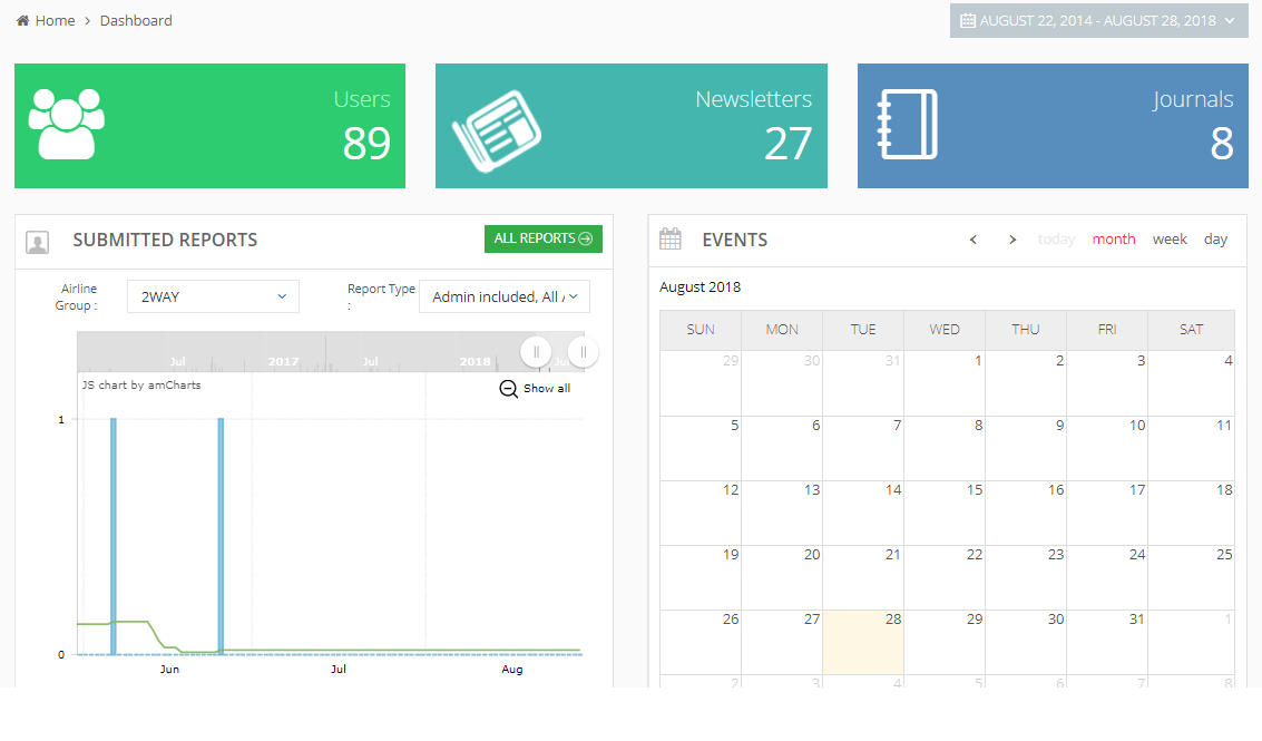
The backend system gives you a dashboard that shows a summary of important activity and key numbers from different sections and features in the account.
When you login to backend system, you see the dashboard by default. When you are doing any other task in your account, click on Dashboard available in the left sidebar to see the dashboard, as below.
Set Time Interval
For all details available on the dashboard, you can select a time interval to see the numbers and data for that time period. By default, it shows the dashboard for the entire account history. Click on the small arrow available next to the current date, as below.
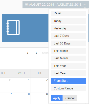
Select option Yesterday to see the dashboard statistics for the previous day, or Last Month for the previous month, or any other option.
Click on Apply button. The dashboard shows the details for the selected time period option now.
Users
See the total number of users listed in this account. (Please see List of Users for more details.)
Newsletters
See the total newsletters that you have created so far in this account. (Please see List of Newsletters for more details.)
Journals
See the total number of journals listed in this account. (Please see List of Journals for more details.)
Reports
In Submitted Reports, you can see a chart view of reports that users have submitted so far (please see Using Reports for more details.)
On X-axis, you can see the time interval for months.
On Y-axis, you can see the count for the number of reports.
At any time, the graph shows the number of submitted reports for the time interval that you see along X-axis in the graph.
In the graph area, take the mouse pointer anywhere and you can see the exact reporting value of that location, for the date and the number, as below. The green number shows the average value for the period selected.
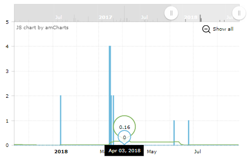
At the top of the graph area, you can see an option to scroll the time interval in either direction – forward or backward.
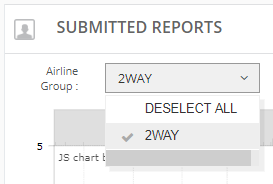
Reports Filters
In the graph area, you can see following filters for the reports.
Airline Group: Select an airline group to see specific reports for the selected airline group only.
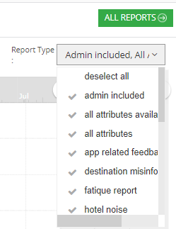
Report Type: Click this drop-down and you can see that all report types are selected by default, to generate a combined chart for these reports. You can deselect one or more report types, to see a custom report in the graph area.
See All Reports
Click on the All Reports button to see the list of all reports.
Events
A calendar view shows all the events that you have created in this Event module. (Please see Using Events for more details.)
Calendar Views
Use conventional calendar view settings to change the view for month, week, or day. For any calendar view, use the navigation arrows to move to preview or next month, week, or day, depending on your current view. You can also see Today to see the calendar for the current day.